Black Panther and the Photoshop Selection Tool
My photoshop journey continues with Black Panther. As you’ll know from my review I really like the Black Panther mini figure but I felt the colours were a little flat. I wanted to use photoshop to help me out.
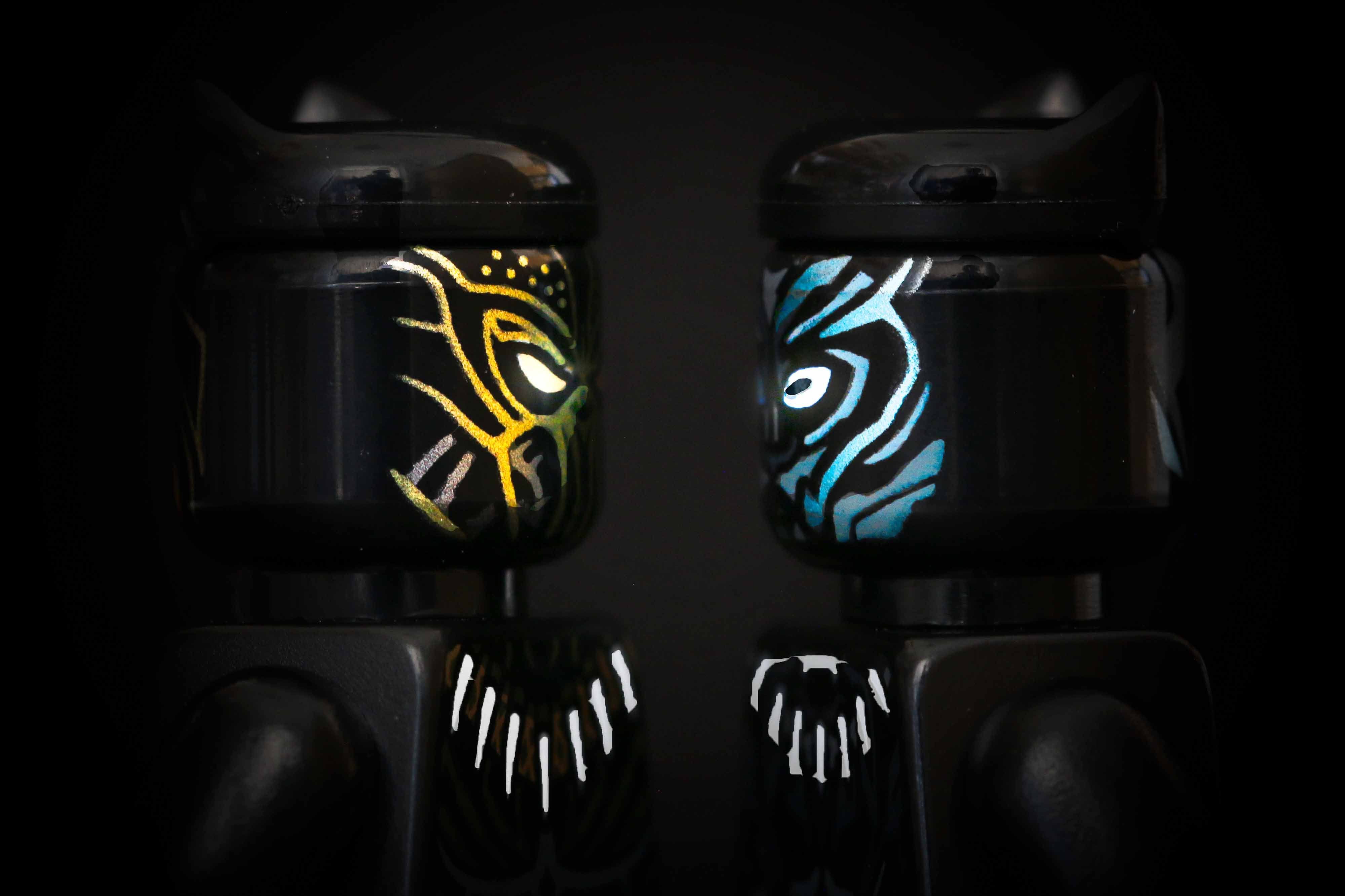
For this shot I wanted a poster-esque face off between Black Panther and Killmonger. The first challenge was positioning them so it appeared they were facing each other. This was a bit of trial and error so I could get them so one eye was visible and both at the same angle.
Both figures turned out to be quite reflective so I had to shot in a fairly dark environment and use a long exposure to minimise it. I also set up a black background with my camera bag and used a black hoody to try and shield them from the light reflecting too much.
After lots of shots I settled on using this one to edit.

Lightroom
This time I didn’t do much in Lightroom. I cropped to fill the frame with the characters but that was it. If you read my last behind the scenes with Lord Garmadon you’ll know I used lightroom unnecessarily and I didn’t want to make that mistake again.
And so the photoshop.
Photoshop
I started in photoshop with this image.

My vision for this was to really make the marking stand out so I knew there would be a lot of using the selection tool. I started by taking the exposure down a little using a brightness layer. I also used a brightness/contrast layer to try and remove the reflection on each characters head.
Next I used the quick selection tool to select the eye of each character. I subtracted the pupil of Black Panther and added a brightness layer to make the eyes stand out. I finished the eyes by selecting the pupil of black panther and adding a brightness layer to darken this pupil. This meant more contrast and looked a lot better.

Using the selection tool I selected the markings on each characters face. This was fairly time consuming because it kept getting confused and trying to join everything up. I used the remove tool to get only the markings then added a brightness/contrast layer to increase the brightness and a hue / saturation layer to add saturation to the colours. I used this process individually for each characters facial markings.
The final markings I used this process of selection for was the necklace. Black Panthers was the hard to select but using the remove tool enabled it to all be selected and brightness adjusted accordingly.

At this point I’ve had a fair amount of practice of using the selection tool and applying adjustment layers to only the sections that need it. But the shot still has a little too much brightness on the back of each characters head.
To solve this I applied a radial gradient fill layer from black to white and made sure it focussed in the centre of the image. It’s blend mode was set to overlay – after I tried a few other options to see which I preferred.
Finally, I wanted the eyes to stand out even more. To achieve this affect I used a colour dodge layer. I used the white brush to paint the eyes and really make them appear to glow in the dark. I feel this helps to bring out the animosity between the two protagonists.

What do you think of the final image? What would you have done differently? I’d love to hear from you in the comments or by the contact form.